Introduction
In the grand scheme of things, corona virus may be seen as but a blip in society. However as it stands now, at the end of March, it has seemed to take over our lives as we know it. In the Bay Area, we have been Sheltered in Place for nearly two weeks now. While we are all doing the best we can individually, the resolution of a global pandemic is the responsibility of our governing bodies.
With people dying, getting sick, and stressing about lost wages and economic impacts, the government should be taking an active role in identifying, stimulating, and producing the most robust solutions to this pandemic. Ideally, the administration and the federal government would have taken steps to neutralize the threat back in January when the first cases were reported. Waiting until mid-March to acknowledge, much less confront the issue, has no doubt led to dramatic losses that could have been avoided. However, we are in the present position, and it is up to the American people and the government now to reform and correct course to prevent further catastrophe, both public health wise and economically.
Meanwhile, as I sit at home with my school work on pause and the future of my last semester of college dangling in uncertainty, I decided to take some time to understand the predicament in the way I learn best: with data and graphics.
In the article below, I start with some compelling visualizations and graphs, and then follow with descriptions of the dataset, my code, and my process.
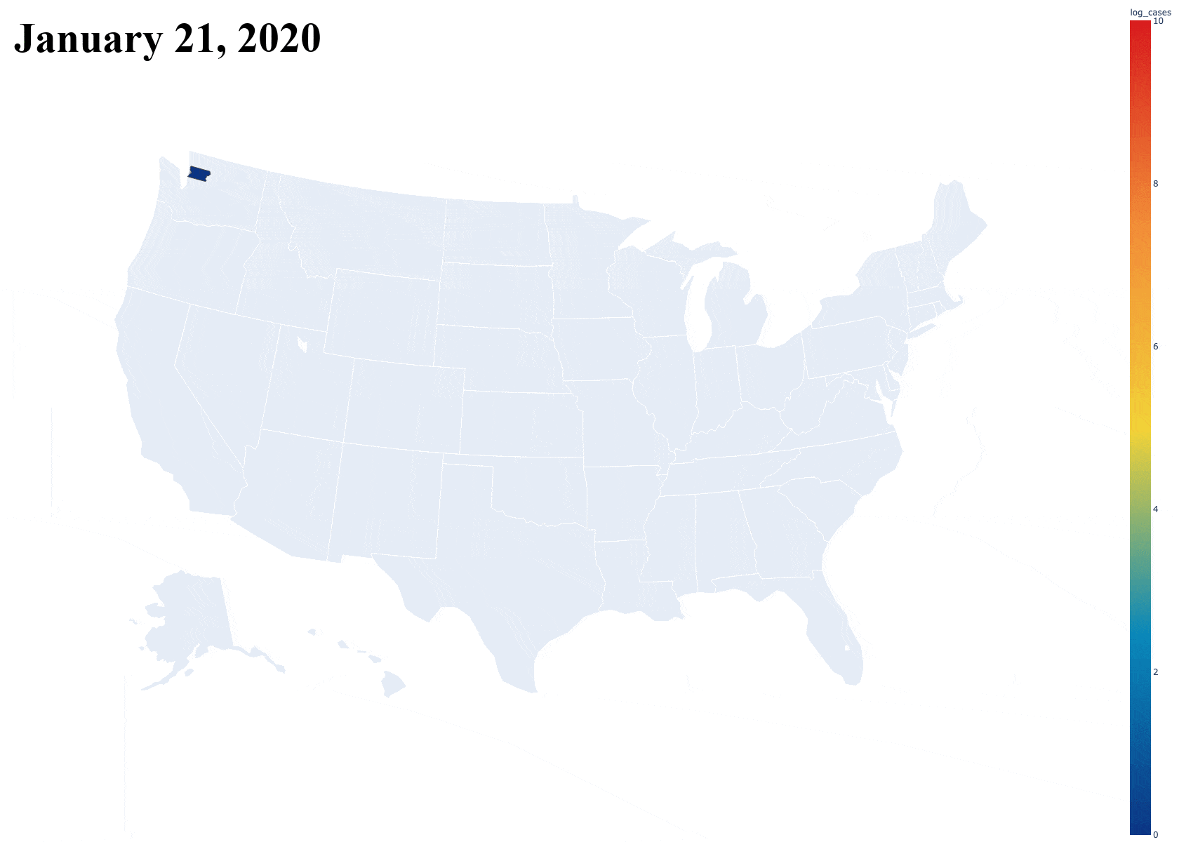
The Dataset
The New York Times has been writing a lot of articles and reports in regards to the outbreak of the coronavirus, especially because New York City has been hit so hard by the pandemic. The credit for the dataset goes to the reporters and data journalists at the NYTimes who have dedicatedly collected and updated this data so we can come to our own conclusions about the situation. Democratizing data is very important to transparency and freedom of thought. The datasets can be found here on GitHub.
As per the request of the dataset owners, the following description is included. Data from The New York Times, based on reports from state and local health agencies.
First Steps
The first step of every Data Analysis and Visualization project is loading the csv into a data frame. Because this was a Python project, I used Pandas to load and clean the data frames.
df = pd.read_csv("https://raw.githubusercontent.com/nytimes/covid-19-data/master/us-counties.csv", dtype={"fips": str})
df['county,state'] = df['county']+","+df['state']
df['log_cases'] = np.log(df['cases'])
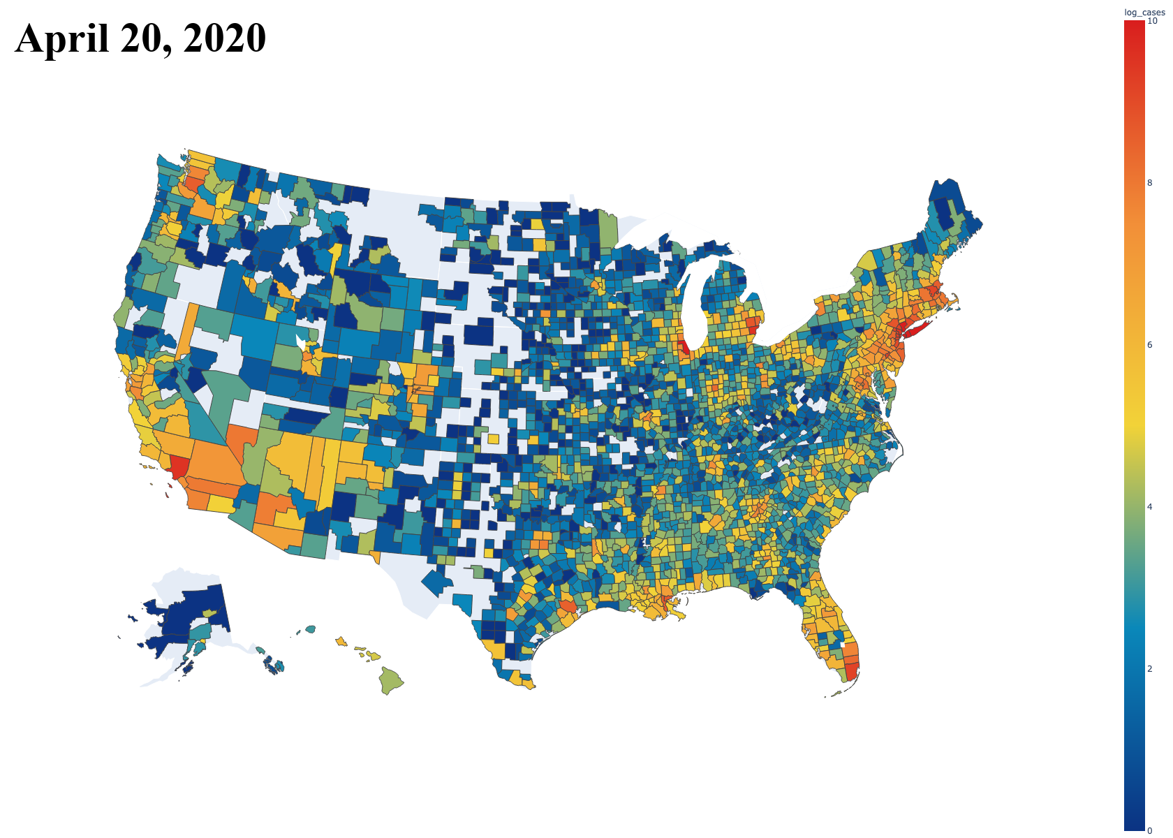
With this super simple loading script and a small function to split the data frame and return data only on a specified county, I was able to obtain a graph that displays the growth of one single county over the dates so far. It includes both cases and deaths in separate lines, just like the data presents. Below is an example of this graph for Los Angeles County, California [Note: Plot updated on 5/7/20].
Then, the next task was seeing how this compared to the rest of the counties in the country. I originally plotted all of the counties, but this resulted in a massive graph file that was slow to interact with because of the sheer number of counties. I later restricted it to counties with over 1000 cases. [Note: Plot updated on 5/7/20]
Next are regressions. Here is an exponential regression on the growth in Alameda County.
And finally the animation gif.