Abstract
Note: The following project and the relevant code was formulated in late 2016 and written in early 2017. The core code has remained the same throughout the process, but the relevant analysis and graphs produced have been updated from time to time. One such update was in September of 2018, and the most recent update of graphs was in August of 2020. Please note that an update to the graphs does not signify a re-write or reanalysis of the information. There may be some discrepancies in the text and the graphs based on new information.
When the founding fathers of these United States came together to form the Articles of Confederation, and later the U.S. Constitution, they formed the structures of government in a way they deemed best for a country at the forefront of international freedoms, democracy, and progress. However, in recent times, through an increasingly partisan government, it seems our country’s leadership is losing its’ qualities of a representational democracy. I gathered data and researched the voting behaviors in both chambers of Congress over a period of 27 years, all the data that the government has made available in a machine readable format.
The effects of highly partisan voting in our Legislative Branch on our democracy is not to be taken lightly. With our congressional chambers becoming increasingly polarized, our system of checks and balances
Preface
I came up with the idea for this project on the night of the presidential election in 2016. The first thought that came to my mind was that the government could not fail at the hands of one presidential administration because the checks and balances were in place to prevent just that. However, many news sources continued to spread word that with a single party in charge of all three major decision making chambers of government, and I began to question the strength of the checks on power between the Executive and Legislative branches. I began to question whether Congress really represented their constituents or simply made decisions based on party lines. The results were demoralizing but it is something that we as constituents can fix by becoming more aware of the way our elected representatives vote. We can enact change by letting our congressmen and congresswomen know what our priorities are as citizens of this country, and by ensuring they indeed represent us and not the special interest groups or the party they align themselves with.
This is by no means meant to be a partisan report. I have taken extreme care to remove any political or party bias from this investigation. My goal here was not to point fingers at any party or any chamber of congress. Rather my research was meant to inform the public that we as constituents are the new checks and balances on our elected representatives. We must take on responsibilities we previously disregarded and remind our representatives that they do not work for donors. They do not work for special interest groups. And they definitely do not work for a political party.
Results
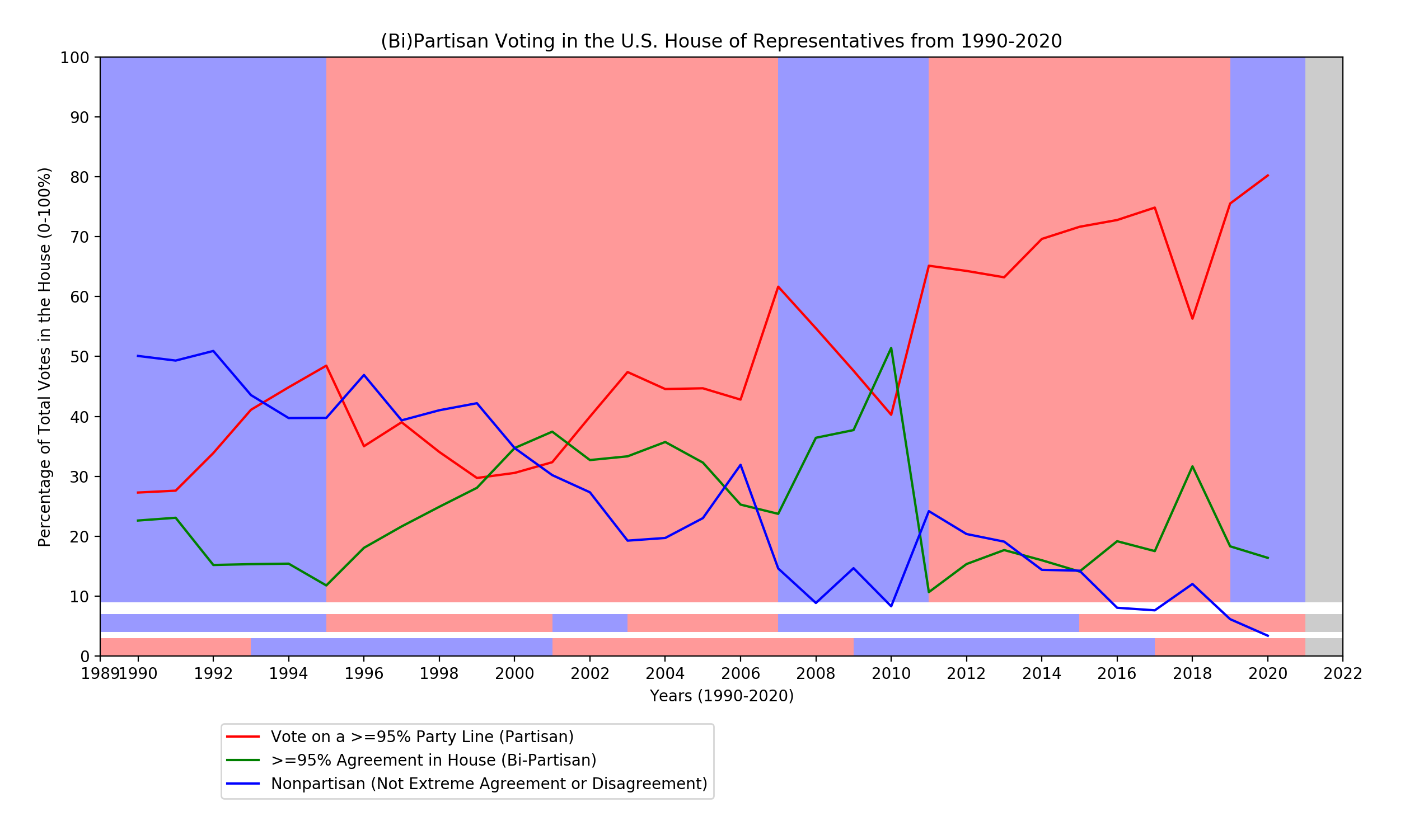
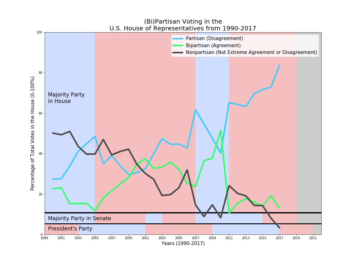
The colors on the background of the graph are as follows: The top and largest color block represents political party majorities in the House. The second row shows the opposite chamber, in this case the Senate's majority parties. And the final row shows the political party of the POTUS. This is to help understand how party dynamics may have played a role in partisanship, although I did not study any findings correlating party to partisanship as part of this investigation.
The graph above show the voting patterns in the United States House of Representatives from 1990 to July 2020. The 30 year period has been one of the most well documented, but also the most divisive in national history, perhaps since the Civil War. The source is from the house clerk's website.
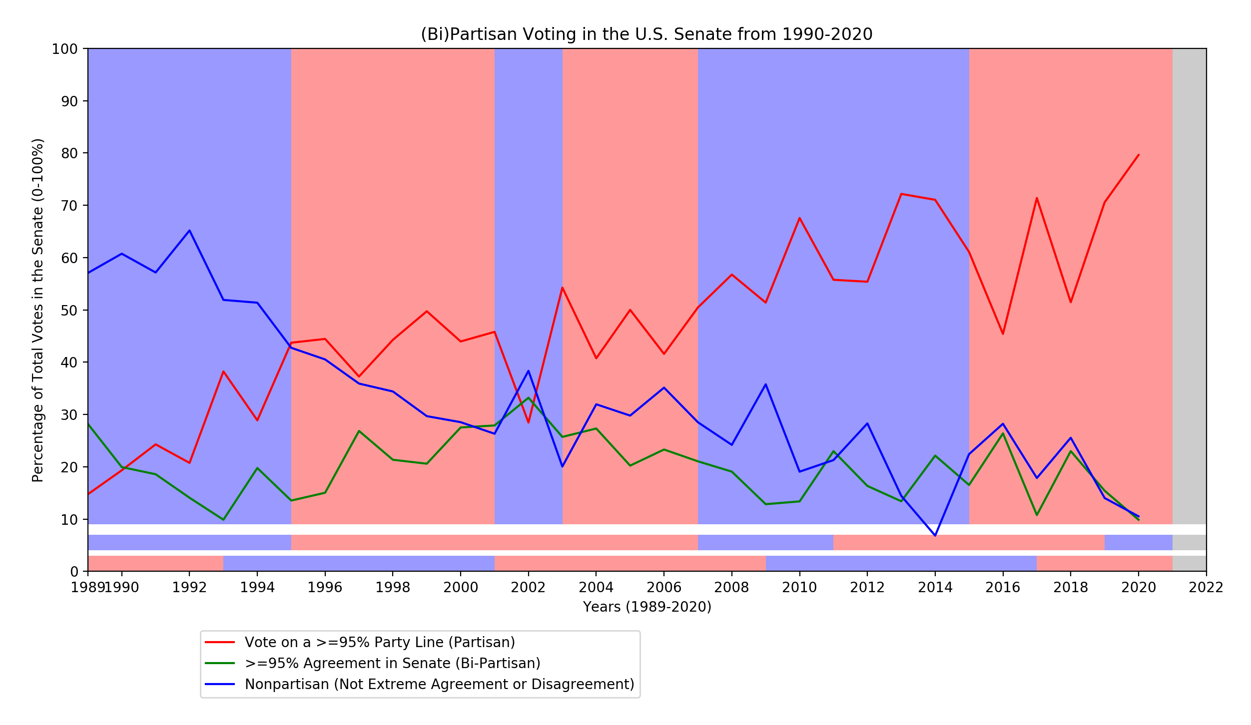
The colors on the background of the graph are as follows: The top and largest color block represents political party majorities in the Senate. The second row shows the opposite chamber, in this case the House's majority parties. And the final row shows the political party of the POTUS.
This next graph shows voting patterns in the United States Senate, from 1989 to July 2020.
As displayed by the graphs, in both chambers of congress, the House of Representatives and the Senate, Partisan voting has dramatically risen over time. In the Senate, the proportion of votes that were deemed partisan increased from 19.3% in 1990 to 84.7% in 2017. Meanwhile in the House of Representatives, the same statistic rose from 27.3% in 1990 to 83.3% in 2017.
What’s more disturbing though is the sharp drop in nonpartisan votes. Bipartisan votes tend to fluctuate because there are often bills and motions within the chambers that are overwhelmingly popular or unpopular, and these include attendance calls and motions for the nation to honor individuals. However, nonpartisan vote proportions demonstrate proof of politicians voting for their constituents and not blindly based on party pressure and affiliation.
The information gathered on years before 2000 was simply to set a benchmark of where this country’s government has been in the past on partisan voting. By a close analysis of Graph A, one can see that each time the Republican party held control of all three entities, there is a spike in partisan voting. This means that in each
Graph Explanations
The two graphs above in the results section display all the collected data for each chamber of Congress. The sum of each year’s vote proportions does come out to 100%. Each year’s collective data accounts for every vote in the chamber excluding the initial roll call for the House of Representatives.
The backgrounds are tailored to deliver the most prominent information for the graph at question in terms of which political party held control of which Chamber of Congress and the White House at any given point in time.
The Process
Coming up with these charts and conclusions was by no means a simple process. I began by setting up a Raspberry Pi computer in my dorm room to act as a small utility server. Then, I identified the two national logs of congressional voting from both the House and the Senate. After sampling a few XML files and scanning through them individually, I wrote a Python based web scraper to aggregate the data from each vote for each year and compile it into a CSV formatted database. Once the Raspberry Pi had returned the database, I wrote a Python data analyzer to calculate the proportion of votes that were Partisan, Bipartisan, and Nonpartisan. Once the analyzer created data structures storing this information, I used matplotlib, a Python data visualization library to plot the proportions against time.
The code can be found on github at https://github.com/shivamparikh/partisan. All of the csv of the annual summaries can also be found in the same repository under Bill Documents. I encourage you to view the raw data and attempt to draw your own conclusions as well.
Sources
Senate
A link to an example of a roll call vote from the Senate: Senate Vote 116th Congress Vote 153, and a link to its relevant xml voting record: https://www.senate.gov/legislative/LIS/roll_call_votes/vote1162/vote_116_2_00153.xml
House
A link to an example of a roll call vote from the House: House Vote from 2020 Vote 178
And its relevant xml voting record: http://clerk.house.gov/evs/2020/roll178.xml
The Analysis
Bipartisan votes are defined as those in which two historically conflicting parties agree or cooperate. The statistic used to calculate bipartisan votes was each vote where over 95% of congressional members voted together in Aye or Nay. I found this as the most accurate form of determining partisanship by the following criteria: If one party makes up 95% or more of a vote category, the opposing party contributed to less than 5% of the vote category and that proves a vote was split by parties.
*Note 2020: With the introduction of many anti-establishment representatives of the major political parties, the 95% bound may be too tight to gauge partisanship, and we could perhaps benefit the analysis by shifting the bound to a 90% group voting.